


首先,我们需要明确一点:Sakura 主题的移动端 CSS 均位于 @media (max-width:860px) 规则内。这意味着,当屏幕宽度小于 860 像素时,相关样式才会生效。在移动端,使用的字体为 chinese-font。
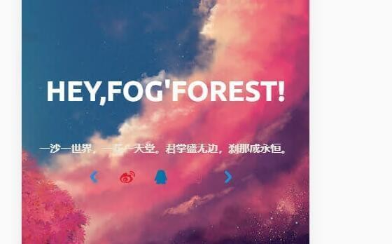
移动端首页信息块显示
在移动设备上,<div class="focusinfo"> 这个区块存放了你的信息,但默认情况下它的 display 属性被设置为 none,因此在手机端是隐藏的。为了让它正常显示,我们需要注释掉这一设置。
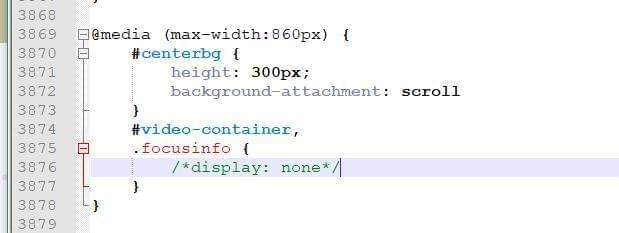
去掉隐藏样式后,我们还需要对这个区块进行美化。请参考以下 CSS 代码:
/*移动端美化样式*/
@media (max-width:860px) {

    /*cusinfo .header-tou img {
    }移动端的头像样式自己改*/
    .center-text {
        /*移动端文字大小*/
        font-size: 40px;
    }

    .focusinfo .header-info {
        /*移动端首页一句话*/
        display: flex;
        flex-direction: column;
        align-items: center;
        justify-content: center;
        font-size: 15px;
        background: none !important
    }

    .focusinfo .header-info .top-social_v2 {
        /*移动端社交图标*/
        display: flex;
        justify-content: center;
        align-items: center;
        margin: 15px 0px;
    }

    #centerbg {
        /*移动端背景全屏*/
        height: 100vh;
    }
}
预览
有更详细的吗?
博主怎么像你这样把社交图标移动到侧边栏
博主我想问一下初学HTML,CSS,JS 后该如何学习可以做到您做的这个网站的程度呢
我只能建议你善用 F12,我并不是专业的开发
学废了 {{xiaoku}} {{doge}}
小白表示好难
美化系列教程讲的真详细 {{dianzan}} 收藏收藏 {{xieyanxiao}}
你好,我想问下,我手机端那三道杠的导航点开后一片空白是什么原因
博主博主,Safari浏览器移动端的返回顶部的按钮好像用不了诶
没有苹果设备无法测试 {{xiaoku}}